Put the style first
Image tools default to a polished photo look. To get anything else, say so early. "A watercolor painting of a fox in autumn leaves" works better than "a fox in autumn leaves, watercolor", because the first words shape how the tool reads the rest.
Then describe what makes the style recognizable. A style name alone gives a generic version; a few words about texture, color and line give a specific one.
Painting styles
For any painting style, name the paper or canvas and the brush. Those surface words are what make the result look painted rather than filtered.
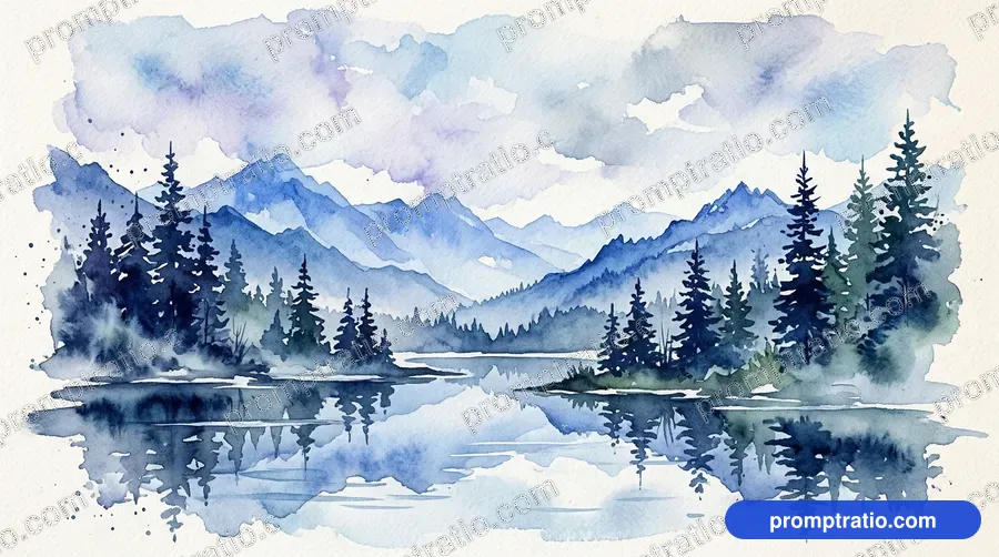
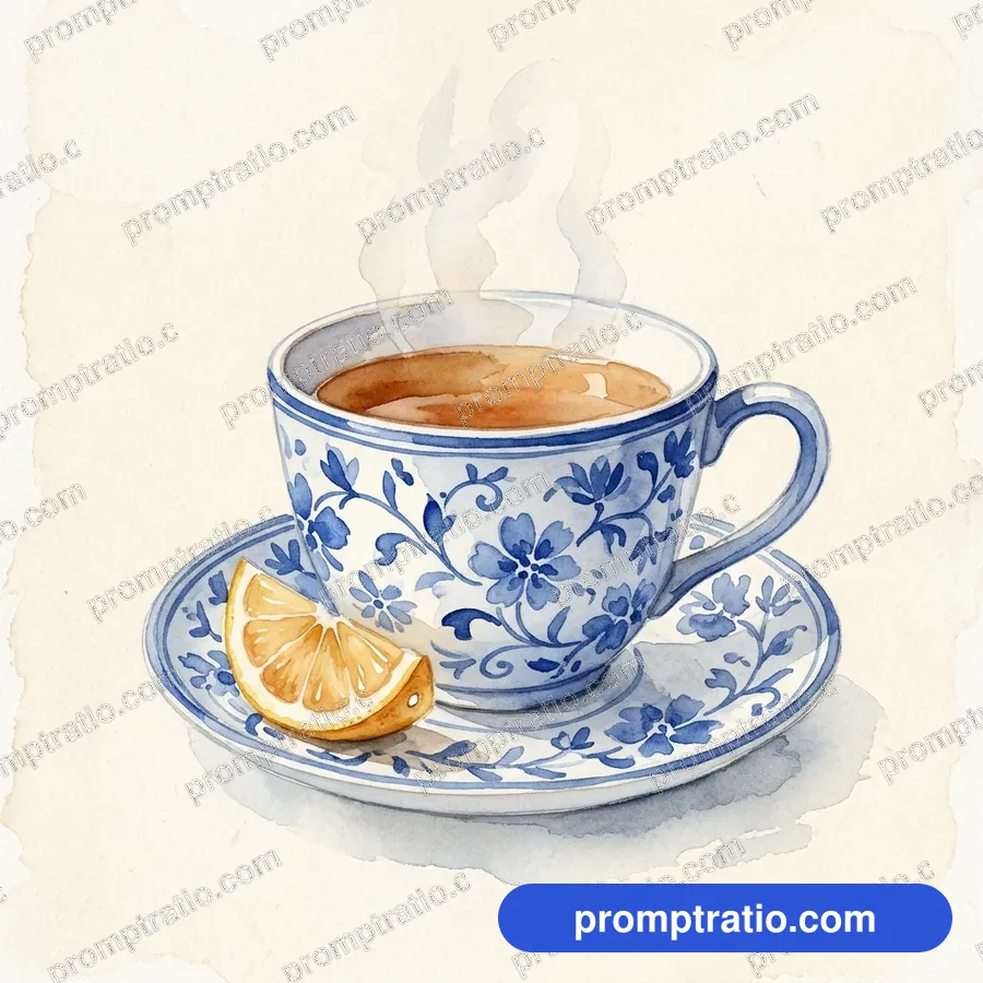
- Watercolor: soft washes of color, visible paper texture, colors bleeding at the edges, white paper showing through. Add "loose" for a sketchy feel or "detailed botanical" for precision.
- Oil painting: thick visible brush strokes, rich deep colors, canvas texture. "Impasto" means very thick paint; "classical" brings old-master lighting and dark backgrounds.
- Gouache and poster paint: flat opaque areas of color with crisp edges; good for illustrations and children's book looks.
- Ink and line art: black lines on white, no shading or simple hatching. "Single continuous line" gives the popular one-line drawing look.
Digital and 3D styles
- 3D render: smooth surfaces, soft shadows, a clean studio look. Add "soft plastic" or "matte clay" for a toy-like feel, or "glossy" for a product look.
- Isometric: a 3D scene seen from above at an angle with no perspective, like a tiny diorama. Great for rooms, buildings and maps.
- Pixel art: square pixels, a small limited color palette, retro game look. Say "16-bit" or "8-bit" to set how chunky it is.
- Low poly: shapes made of flat triangles, simple and geometric.
- Clay and stop motion: handmade look, fingerprints in the clay, slightly uneven shapes, miniature sets.
Anime and cartoon styles
For anime, describe the look rather than naming a studio or artist: "anime style, clean line art, soft cel shading, large expressive eyes, bright sky with big white clouds". The same goes for cartoons: "a friendly cartoon style with thick outlines and flat bright colors".
Naming living artists or famous studios to copy their style is best avoided. Describing the visual qualities gets you a similar feel and keeps the picture your own.
Photo styles are styles too
Even photos have styles. "Cinematic" suggests a wide frame, dramatic light and color grading like a film still. "Documentary" suggests natural light and real moments. "Fashion editorial" suggests strong poses and clean backgrounds. "Vintage film photo" adds grain and faded colors.
Camera words also help: "shallow depth of field" blurs the background, "wide-angle" exaggerates space, "macro" means a very close detail shot. Use one or two, not a list.
Posters and minimal designs
Vintage travel posters have flat areas of color, simple shapes, strong outlines and a limited palette. Ask for "a vintage travel poster style with flat colors and bold shapes" and add "no text" if you will place the title yourself.
Minimal designs need restraint in the prompt itself: one object, one or two colors, lots of empty space. "Minimal" alone is not enough; say "a single object on a plain background with lots of empty space".
Mixing styles carefully
Some mixes work well: a watercolor with ink outlines, a 3D render in a pastel palette, a pixel art scene with soft lighting. Others cancel out: a photorealistic oil painting, or anime in clay. When two style words fight, the tool picks one or makes something muddy.
If you want to explore, keep the subject and light fixed and change only the style word. The "How to change this prompt" box on each prompt page does exactly that with a style used elsewhere in the same category.
Color palettes as style
Color is part of a style, and naming a palette is often the fastest way to make a series look like it belongs together. "Muted earth tones", "soft pastels", "bold primary colors", "black and white with one red accent" and "teal and orange" each set a clear feel.
Keep the palette to two or three colors plus neutrals. Long lists of colors make the tool try to fit all of them in, and the picture loses its harmony. If a result has too many colors, add "limited color palette" to the style words.
Example prompts
Watercolor: "A watercolor painting of a red tram on a hilly street in the rain, loose washes, colors bleeding into wet paper, white paper showing in the sky. No text."
Isometric: "An isometric 3D scene of a tiny bakery with a striped awning, warm light inside, soft matte materials, plain pastel background. No text."
Pixel art: "A 16-bit pixel art scene of a campfire by a lake at night, small limited palette, stars reflected in the water. No text."
Tested prompts on this topic
Every prompt in these categories comes with the picture it made, so you can try the ideas above on a prompt that already works: Watercolor, Oil Painting, Anime, 3D Render, Pixel Art, Clay & Stop Motion, Minimal and Vintage Poster. To trim a finished picture to an exact platform size, use the free crop tool.